Sitch is a new social media app that is based on sending selfies.

My work with Sitch was to make improvements to the already existing UI, to make it look more appealing, young, and engaging.

Sitch.

It’s a selfie.

My Goal

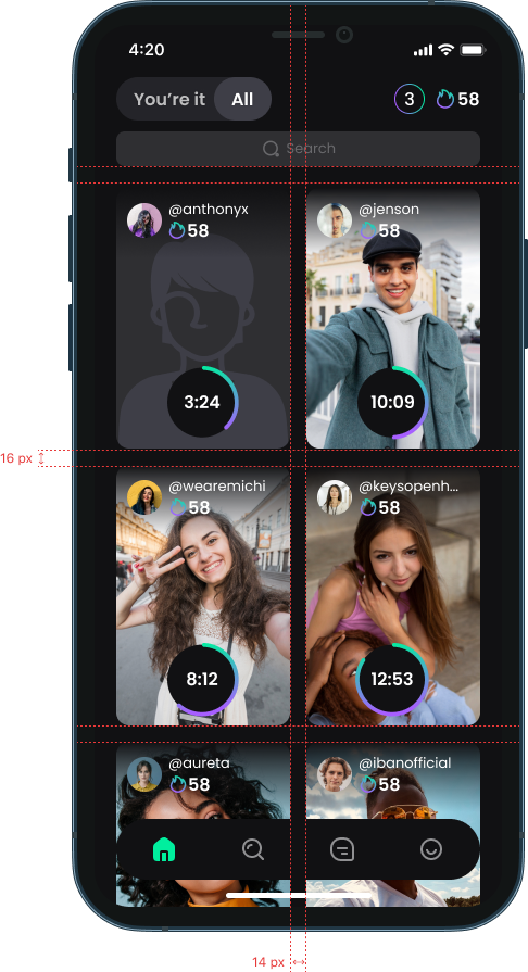
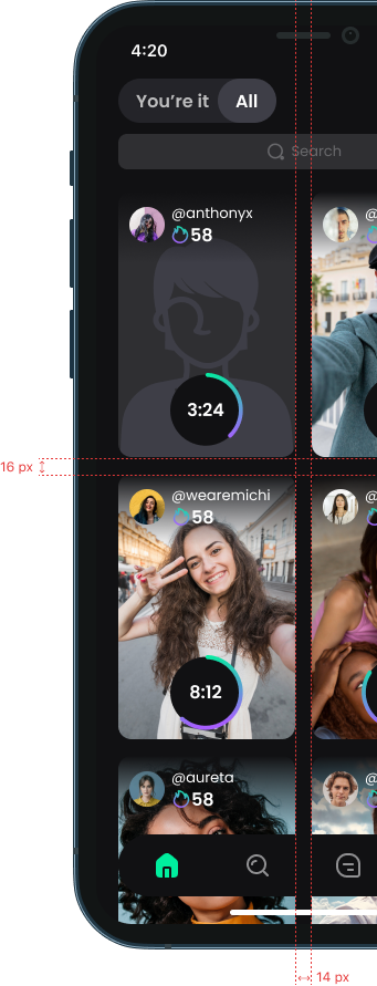
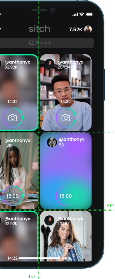
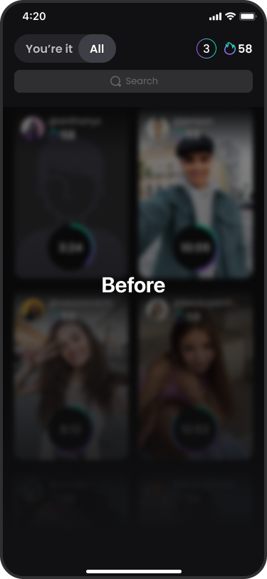
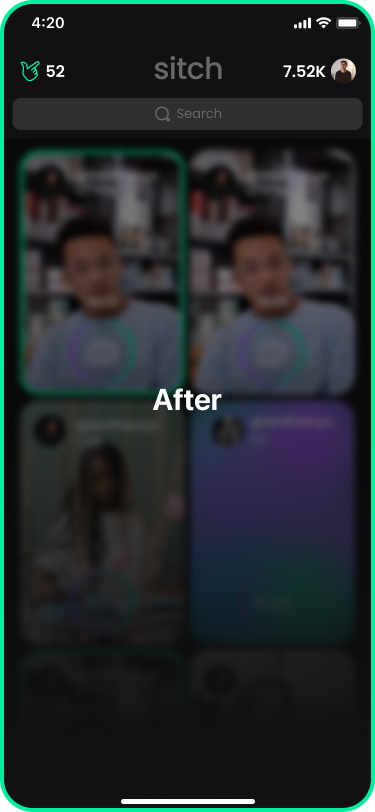
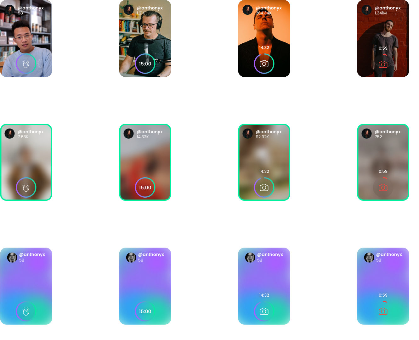
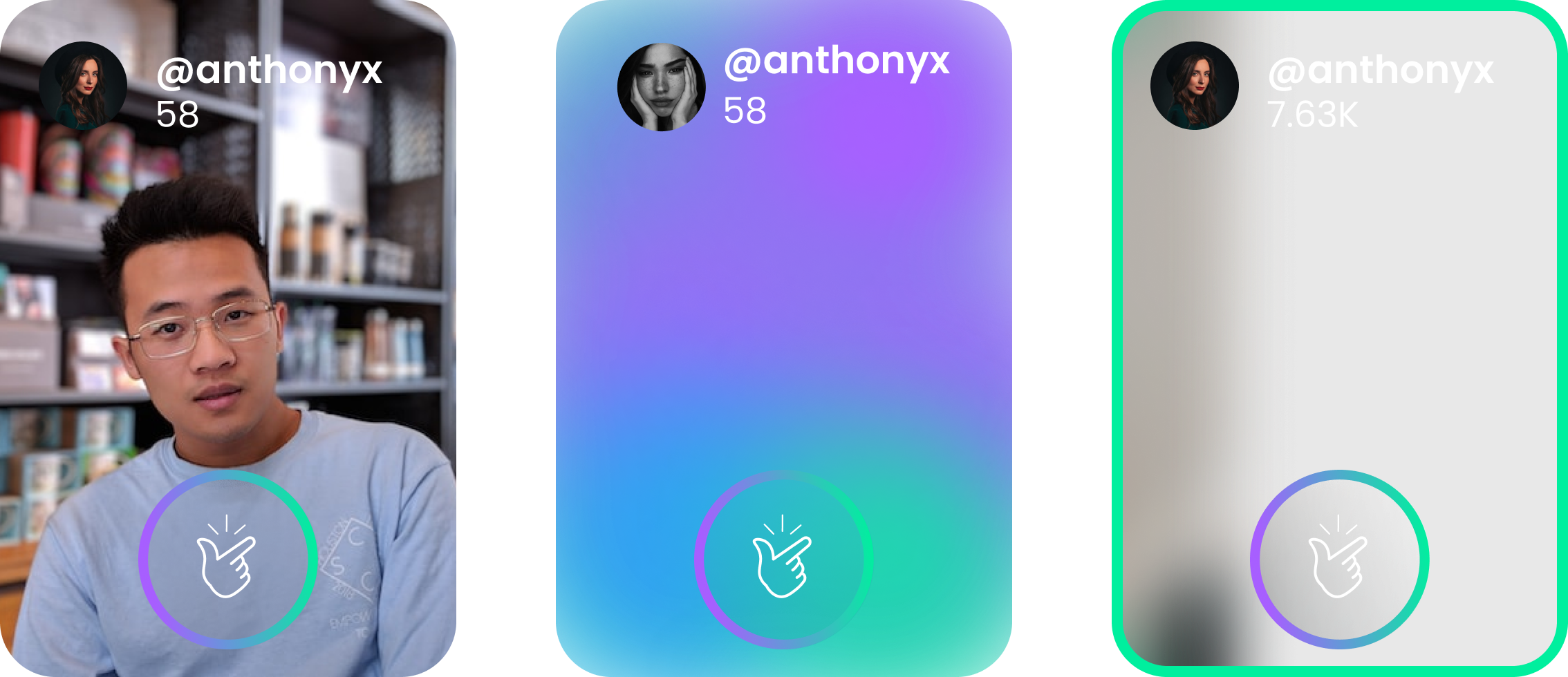
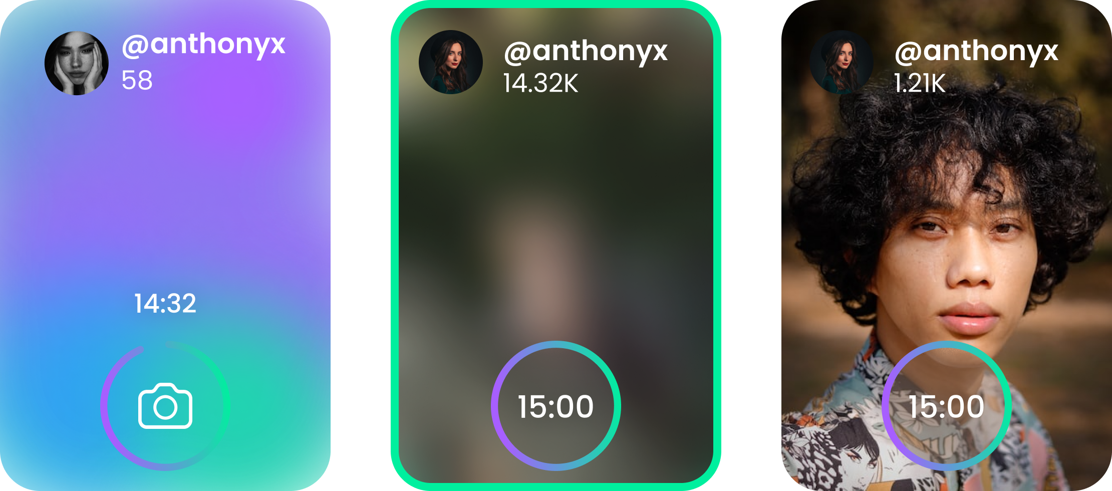
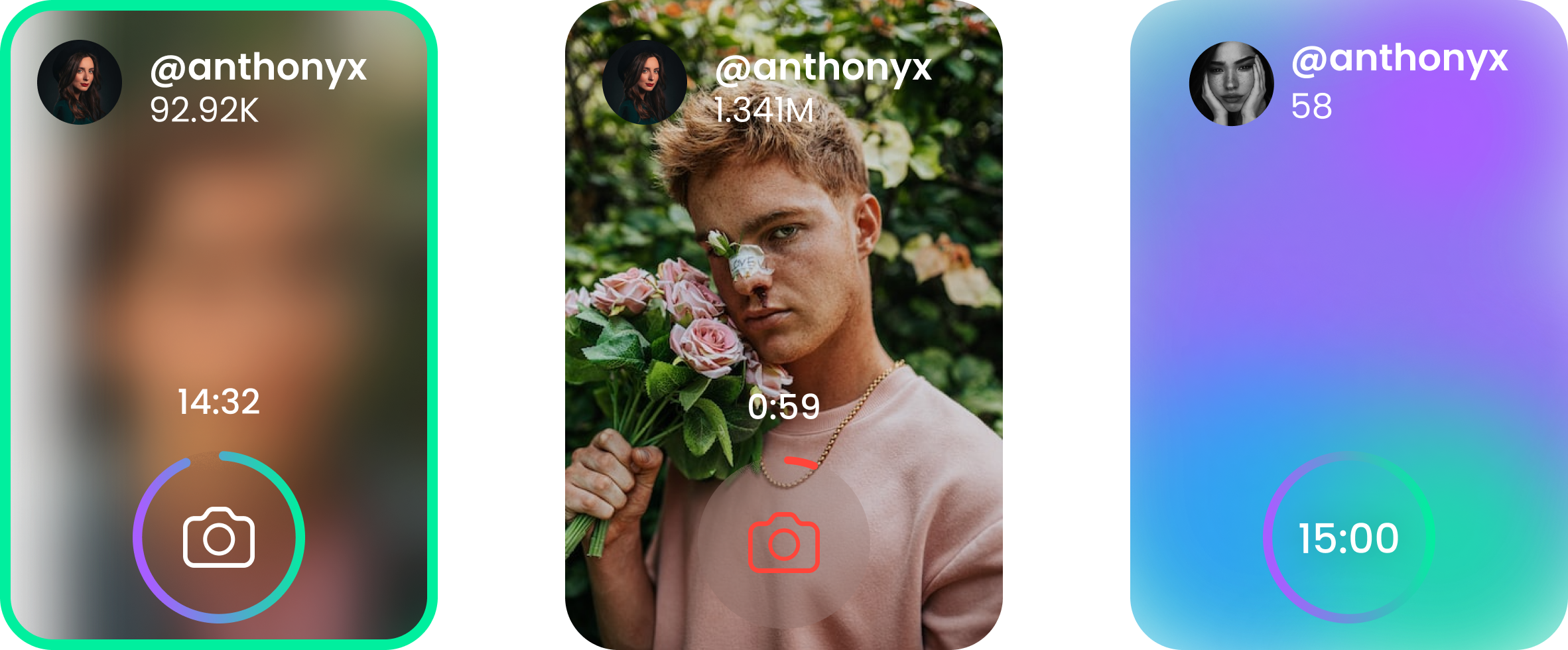
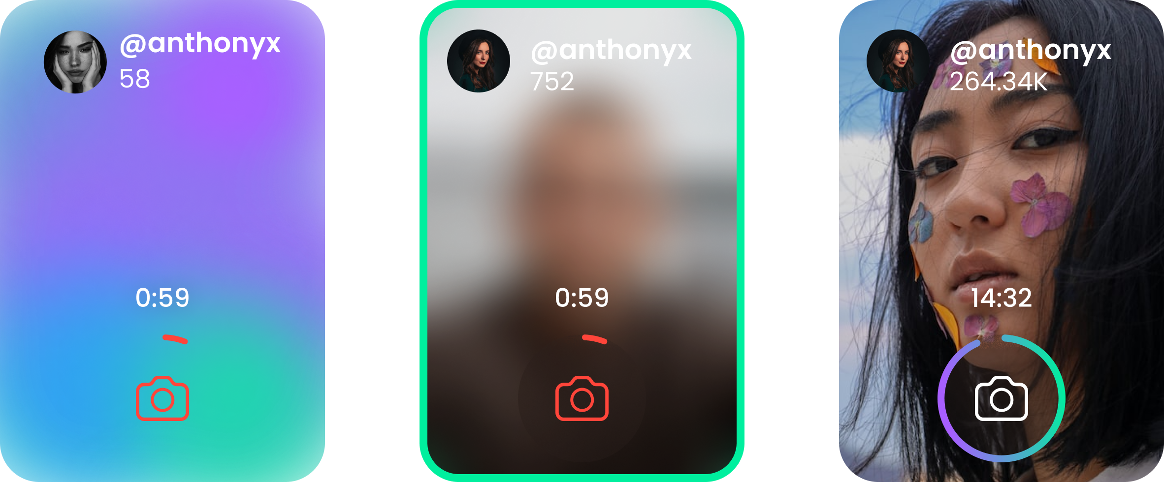
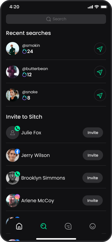
My goal when I started redesigning Sitch was to make it more colorful, more engaging, and overall more comfortable to use. So, the first step was getting to know the design system, deciding what I want to keep, what I want to change, and what I am getting rid of.

Home page

When the task is to renovate an app, the first thing that needs to happen is to understand what the changes you want to make are. With Sitch, I started by adjusting margins. I increased the size of the user cards and reduced the margins. This way, the users get bigger buttons and less wasted space on the screen.
Before
After

New Header

Next step was modifying the header. In a practical way, it means getting rid of the unnecessary toggle, adding brand’s logo, and redesigning the score and sitches amount.

New Interactions

Interactions were not very clear and understandable in the old design, so I mapped them and made new clear interactions for each scenario, to make sure users understand the action they are about to preform

New Search

Our goal on the search area is to make it more engaging. So I made room for the “Top ranking friends” section, by changing the “recent searches” section to be horizontal instead of vertical, and decreasing the “invite to sitch” margins.

Before
After

Marketing

For Sitch’s marketing, I’ve designed captivating images to showcase its uniqueness and appeal. These visuals will be used across digital and traditional channels to boost brand visibility and engagement.

Sitches are over

You can’t send anymore sitches today

Let’s Talk

Shahargold03@gmail.com

“I am looking for awesome clients who want to benefit from my ideas, knowledge and experience. Feel free to get in touch”


    Leave your details here and I’ll get back to you shortly